Claude CodeFigmaHTML/CSS/JSWordPress (custom PHP theme)GitHub PagesRive
TL;DR
Ascenzi & Associates (A&A) is a semiconductor-construction consultancy. Its founder-built first site had stopped opening and couldn't capture inquiries.
My role
I designed the brand and design system, then directed Claude Code to build a bilingual (English and Traditional Chinese) WordPress theme the team can edit without code.
Editable fields
0
in WordPress meta boxes
Interactions
0
audited in the theme
Languages
EN + 中文
bilingual theme
Service packages
0
one shared template
01 · Challenge & Audit
A first site that did its early job, then needed more
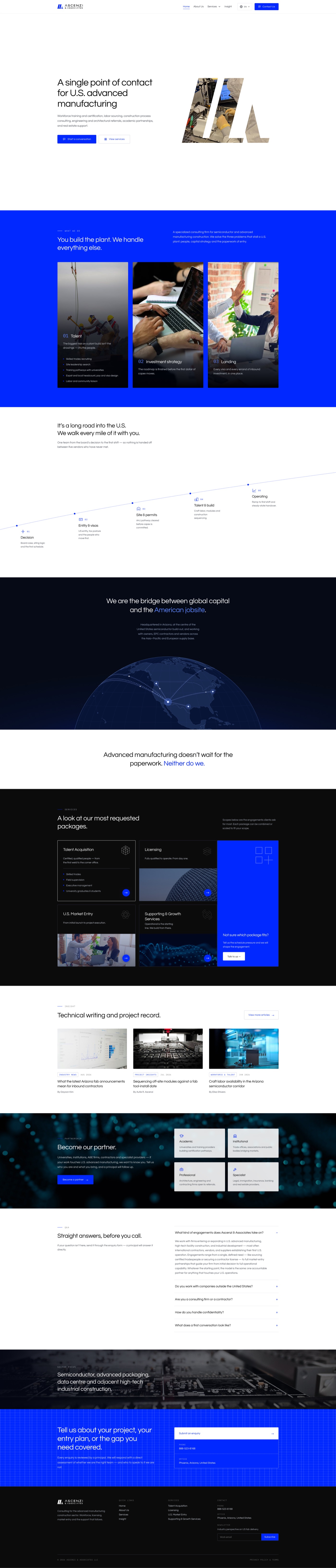
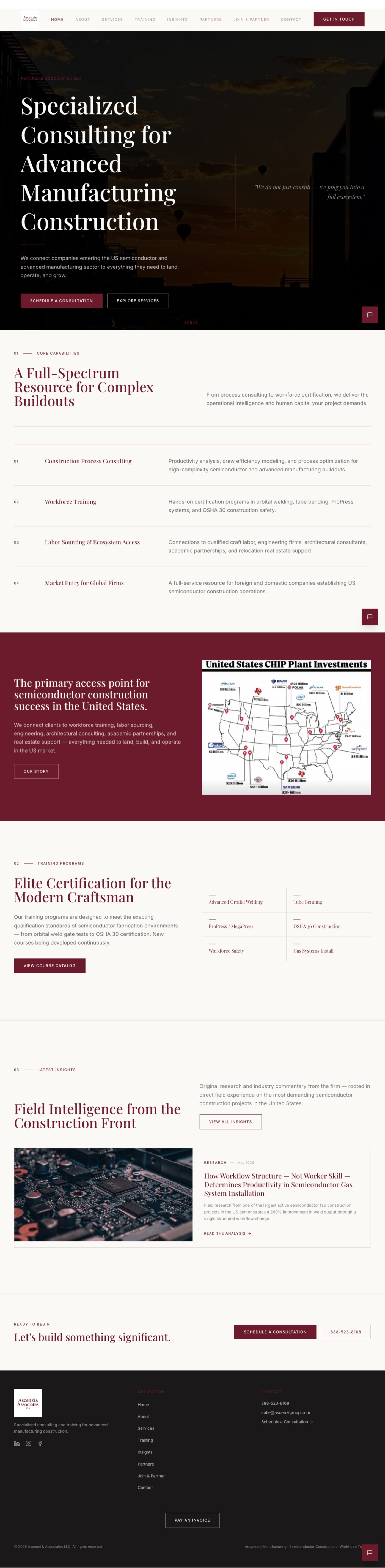
The founder's first site, built on Base44, had stopped opening by mid-July. The new one had to read as an authority, capture every inquiry in a CRM, and let him publish without a developer.
This is critique of the old site, not the person: he built it without a design team.
Home
No clear path
Eight navigation items, many competing actions.
The new homepage uses a client-journey roadmap and two actions.
Before Drag the white bar After
Contact
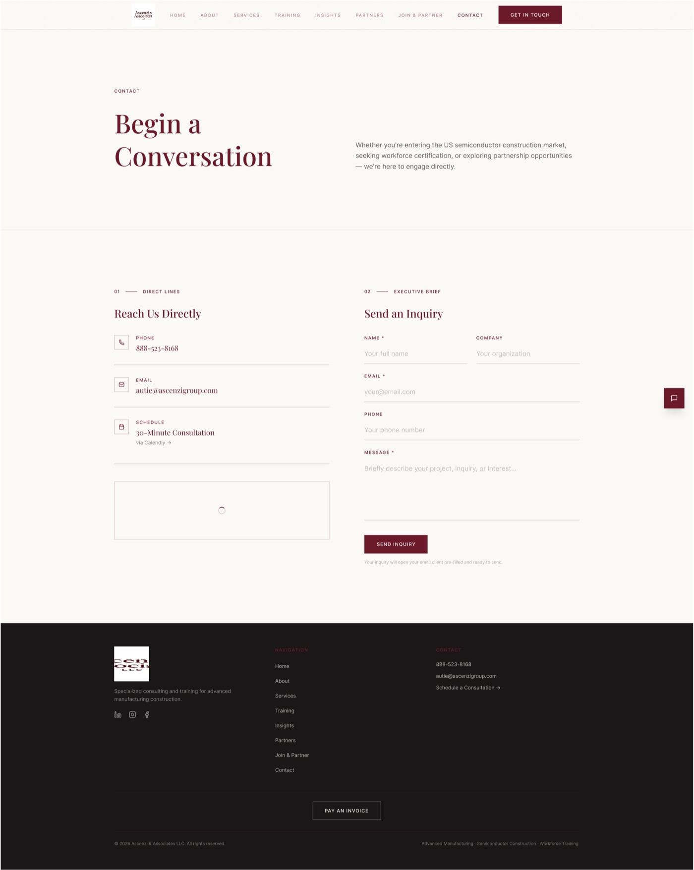
Nothing was captured
The form only opened the visitor's email client, so nothing was stored.
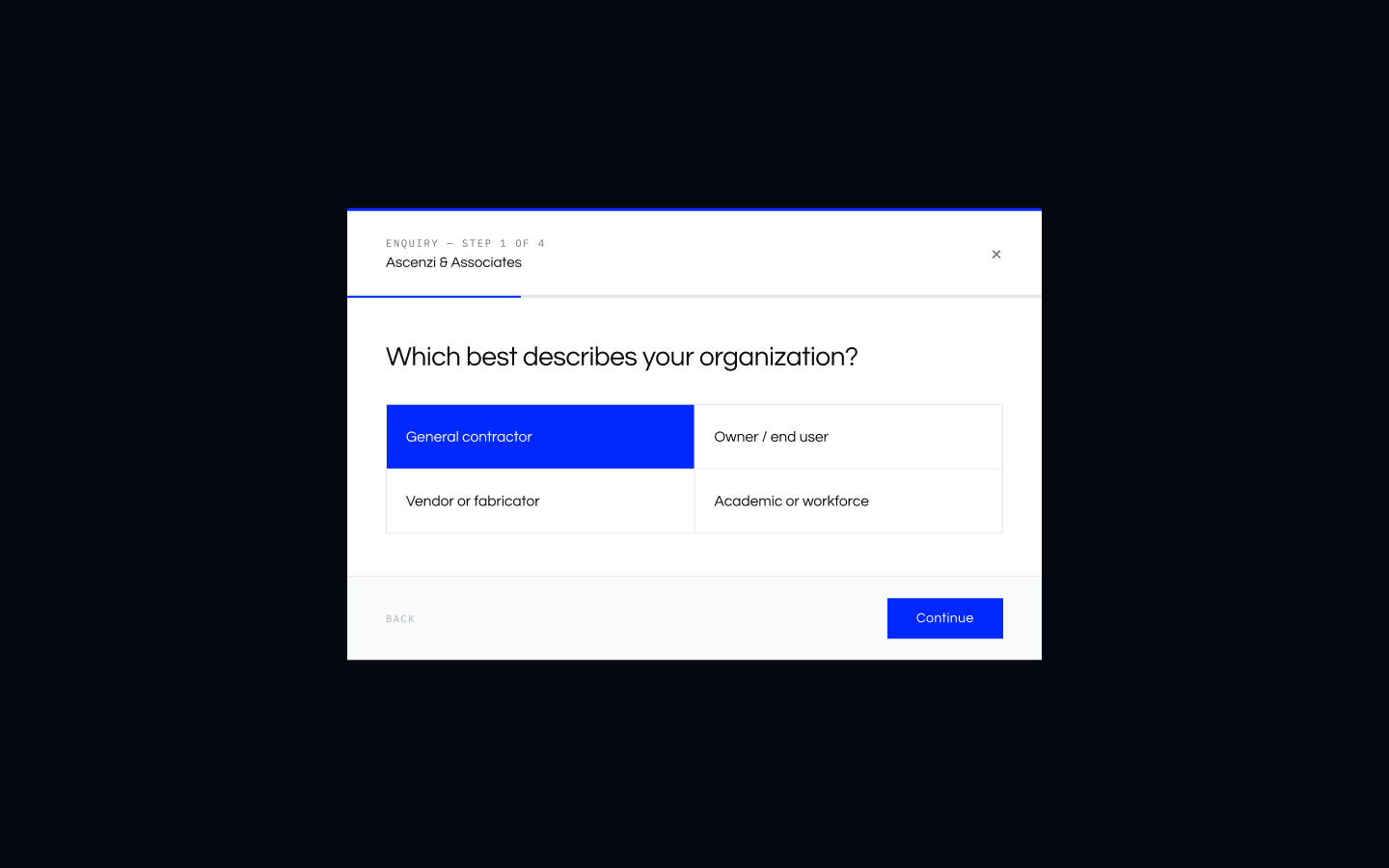
A step-by-step survey now feeds the CRM. Teammates built the connection.
Before Drag the white bar After
02 · Branding
Choosing a logo that works small
The mark had to survive a favicon, not just a presentation slide.
Two directions, designed from scratch.
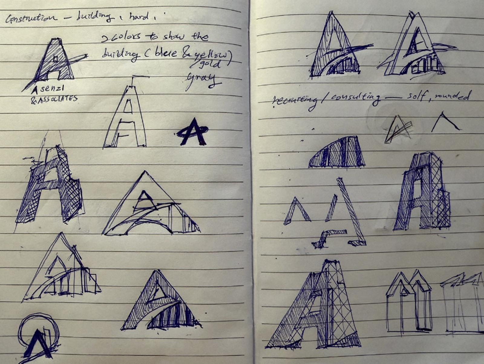
The old serif wordmark was tiny in the navigation, and the AI logo references on my mood board were too detailed to survive that size.
On July 23 I presented two designs: a double-A with angular construction lines, and a circular badge following the founder's direction that looked like a car brand.
The double-A won: cleaner small, better in print, easier to extend.
Early sketches of A-shaped marks.
03 · Design System
Two one-page guides, both v1.0.0
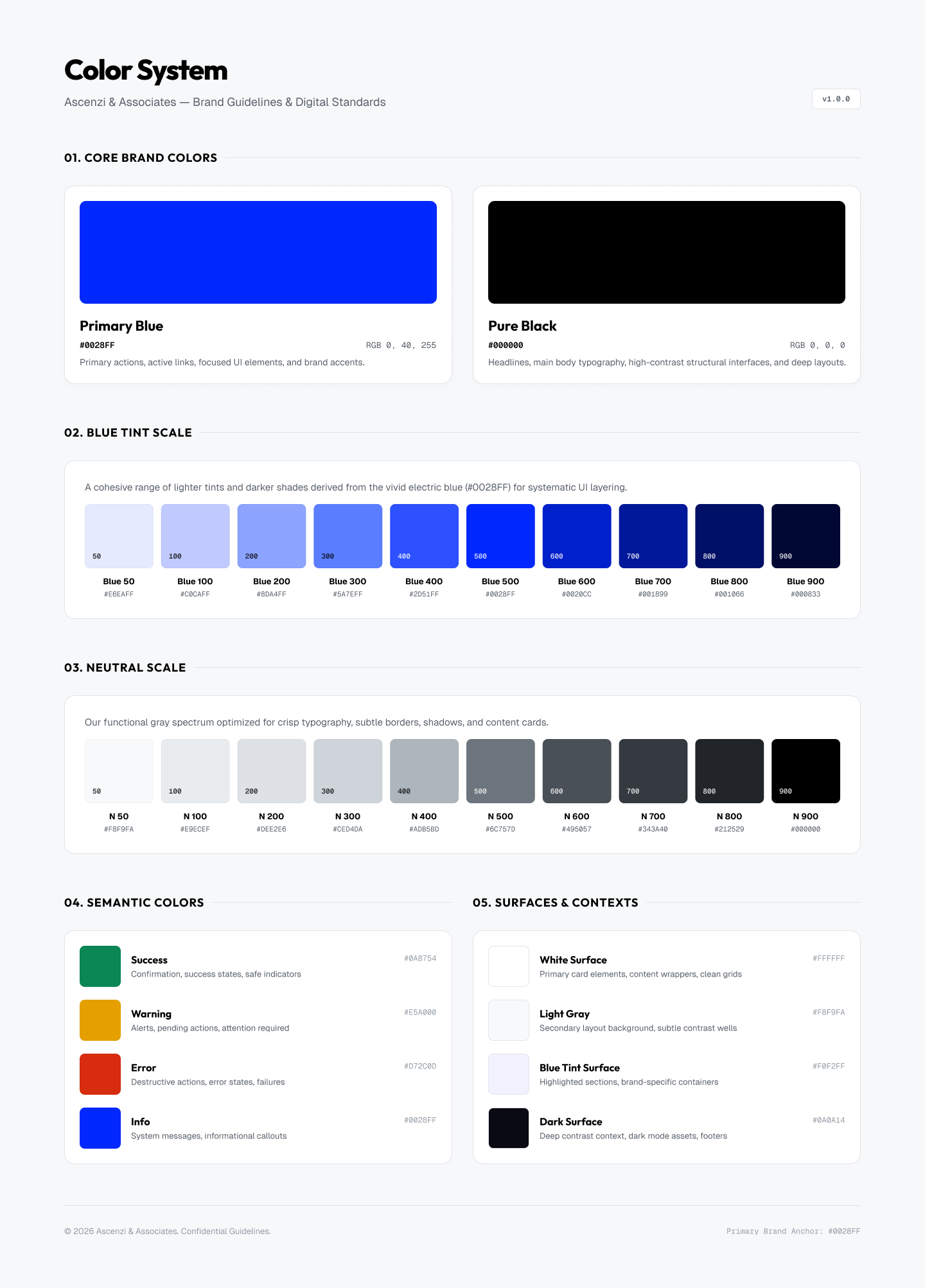
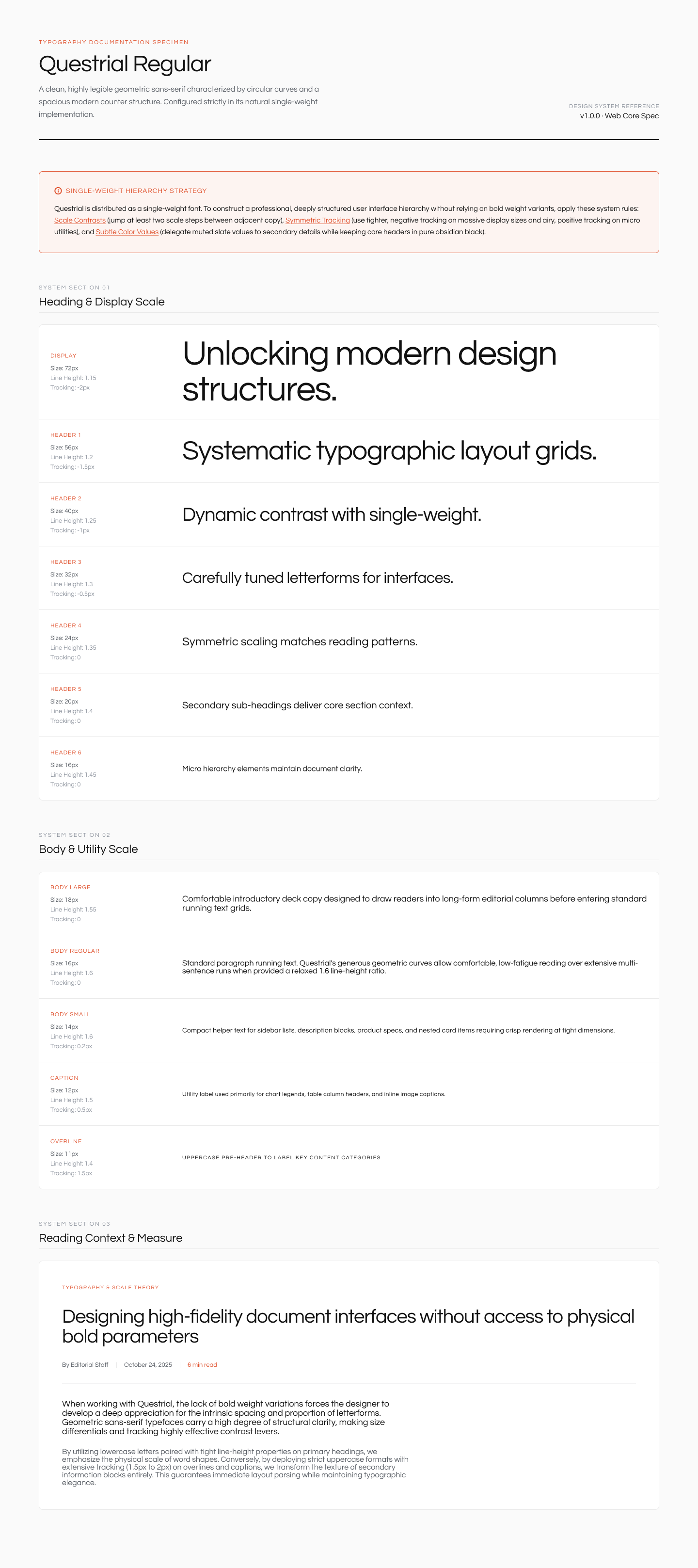
Two one-page guides that feed the whole site.
Color & typography
Two brand colors and one single-weight typeface.
Color: Primary Blue (#0028FF) and Pure Black (#000000), each with a nine-step scale plus semantic and surface colors.
Type: Questrial has one weight, so hierarchy comes from size, tracking, and muted secondary text.
#0028FF
#000000
Color system v1.0.0.Typography spec v1.0.0.
Contrast, calculated from the tokens. Contrast is calculated from the tokens. Failures became rules, such as gray 400 for decoration only and warning yellow only behind black text.
04 · Decisions & Priorities
What we chose, and what we cut
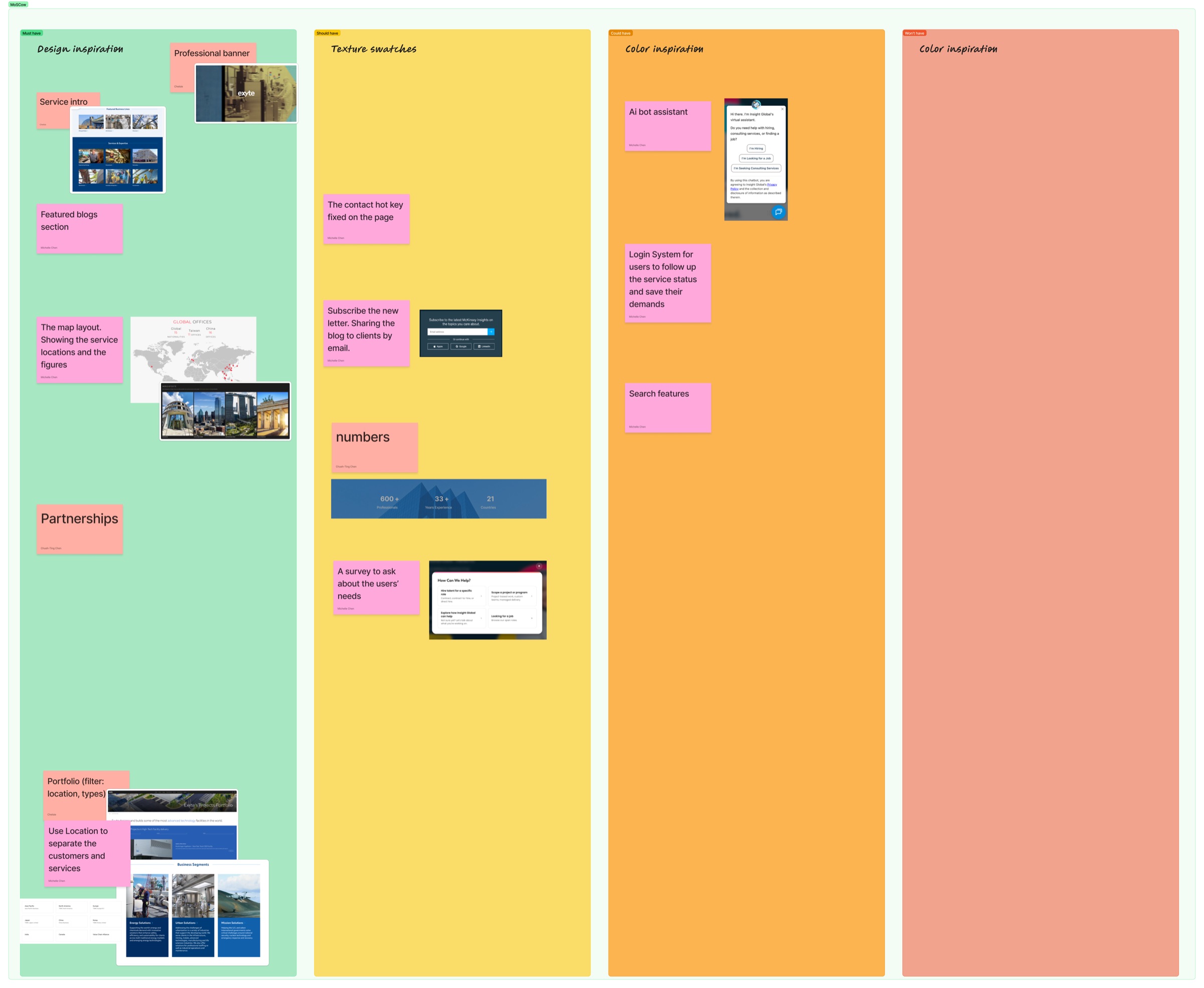
Five decisions, then a MoSCoW pass.
A survey, not a plain email box. The business team wanted email only. I argued that means re-asking everything on a call. The founder approved the survey in the first demo.
A globe, not a map. No data to filter, and a map needs upkeep.
WordPress, not Framer. Framer charged monthly for a custom domain. WordPress fits CRM and two languages better.
One action per page. A Contact button in the navigation, floating on mobile, and no direct email address.
Privacy and CRM. I flagged a privacy policy for every form. HubSpot's free plan handles contacts and auto-replies.
Several "must haves" were cut: the map became a globe, partner logos became a call to action, and the AI assistant and client login stayed out of scope.
MoSCoW board: must, should, could, won't.
05 · Final Design
One system across pages and screen sizes
The homepage, blog, and enquiry survey, on desktop and mobile.
Homepage, desktop.
Homepage, mobile.
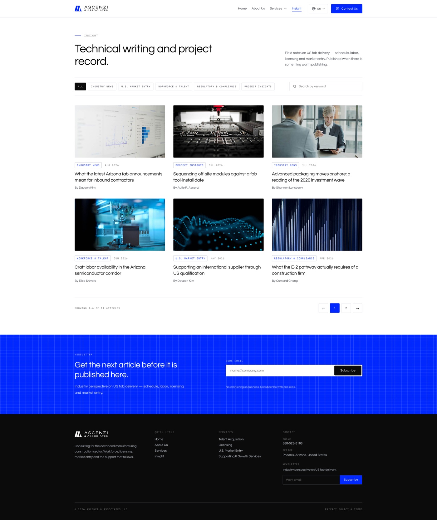
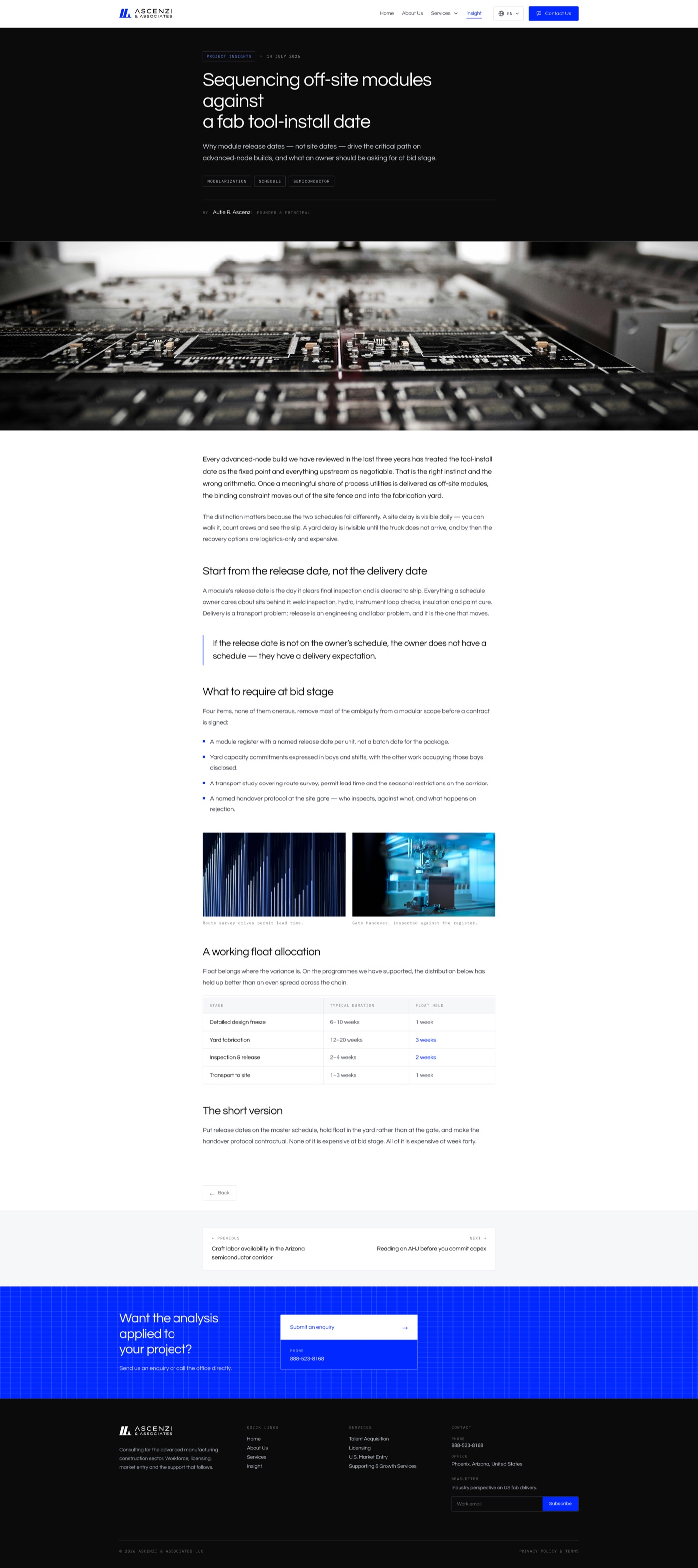
Blog: filters, keyword search, and article template
Insight listing.Article template.
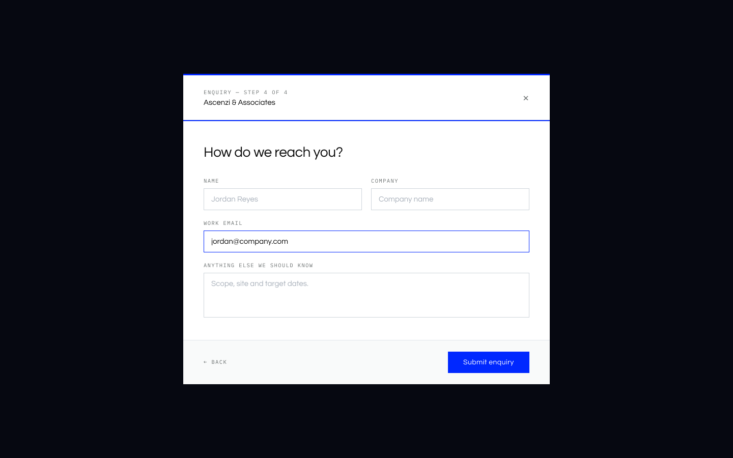
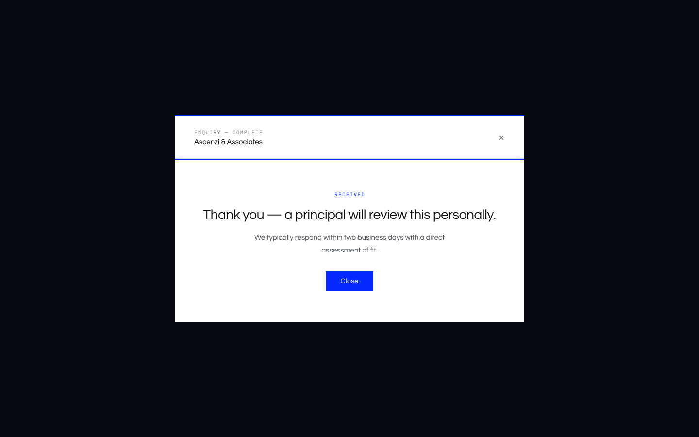
Enquiry survey
Role first.Then need.Answers go into the CRM.
06 · Build with Claude Code
From prototype to a bilingual WordPress theme
Claude Code wrote most of the code. I wrote the requirements, made the design calls, and tested in the browser and in WordPress.
Interactive prototypePublished on GitHub Pages to click through.
Figma importImported into Figma so teammates could comment.
WordPress theme81 editable fields, in English and Traditional Chinese.
One of my calls: the nav and footer had drifted into three versions each, so I chose one for all eight pages.
September 21
The blank-site problem
The installed theme showed only a header and footer. An audit showed the code was complete: no page template was assigned and the meta boxes were empty. Claude Code wrote two scripts to fill them from the prototype's copy. I kept it off my WordPress account and worked only with files I uploaded.
Testing the live site against the prototype caught the rest, such as a carousel that never advanced and a language switcher wired up only once.
07 · Status & Reflection
What I owned, and what's still moving
What I owned
The brand, design system, prototype, and WordPress theme, plus a back-end walkthrough so the team can publish articles.
What teammates owned
Requirements, the CRM connection, domain, test cases, and Chinese translation. The founder wrote most of the copy.
In progress
Pre-launch testing, site animations, and a domain decision. I'll add SEO results after a one-month test.
Reflection
Content was the bottleneck for over a month, so I built the homepage from the company summary and fixed the structure while the words changed. The hard part was the last stretch: knowing why WordPress showed an empty page, and testing the live site instead of trusting the prototype.