UNESCO Volunteer Recruitment

UX Redesign for Clarity & Conversion

Website Nonprofit B2C

Team (1)

1 UX/UI Designer (me)

Timeline

Jan 2025 – May 2025

Tools

Figma

UNESCO mobilizes global education and heritage work, and this redesign shortens the path from interest to volunteer, intern, and career roles on the site.

Self-initiated redesign concept, not affiliated with or commissioned by UNESCO.

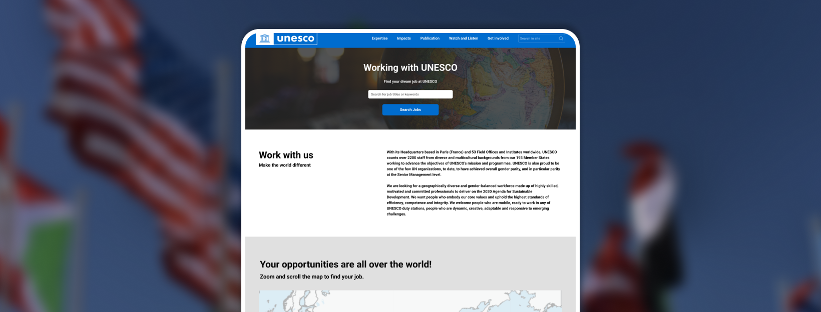
UNESCO Volunteer Recruitment main hero image
01 · Problem Statement

Usability barriers blocking engagement

Through an initial heuristic evaluation and user research, it became clear that the UNESCO website suffered from content discoverability issues, navigation inconsistencies, and unclear role descriptions.

Potential volunteers and professionals encountered:

Hidden career pathways

Difficulty locating the Career and Volunteering search sections from the homepage.

Loading without feedback

Delays in page loading without visual feedback, causing frustration.

Confusing filters

Confusing categorizations and overlapping filter functionalities on the job board.

Text-heavy listings

Large blocks of text without proper hierarchy, making it hard to understand internship and volunteer requirements.

02 · Project Goals

Guiding objectives for the redesign

Improve Discoverability

Create clear, accessible pathways to NGO partnerships, volunteering opportunities, and student programs.

Enhance Clarity

Redesign job and volunteer listings to clearly define responsibilities, required skills, and expected duration.

Streamline Navigation

Fix redundant filters and provide intuitive viewing options (Map, List, and Gallery views) for career searching.

Increase Engagement

Optimize the website's structure to reduce user frustration and drive higher participation in UNESCO's initiatives.

03 · Key Solutions

High-fidelity redesign

Homepage career search, clearer filters and views, scannable listings, and loading feedback, all aligned to UNESCO's global brand.

Solution 01

Career search on home

Search, stats, and job alerts live on the homepage, not buried off-site.

Homepage: career search and calls-to-action up front.

Solution 02

Filters & views

Filters match role types; users switch map, list, or gallery view.

UNESCO Career Page Gallery View
Gallery view.
UNESCO Career Page List View
List view.
UNESCO Career Page Map View
Map view.

Solution 03 & 04

Listings & performance

Scannable role pages (skills, duration, duties) plus loading indicators so waits feel intentional.

Inner job page: scannable role details.

04 · Design Process

From research to tested solution

I structured the full research program around a usability test plan, then layered survey findings, personas, and a career portal audit to guide the redesign.

Phase 01 · Research

Usability Test Plan

Three scenarios: partnerships, volunteering, students.
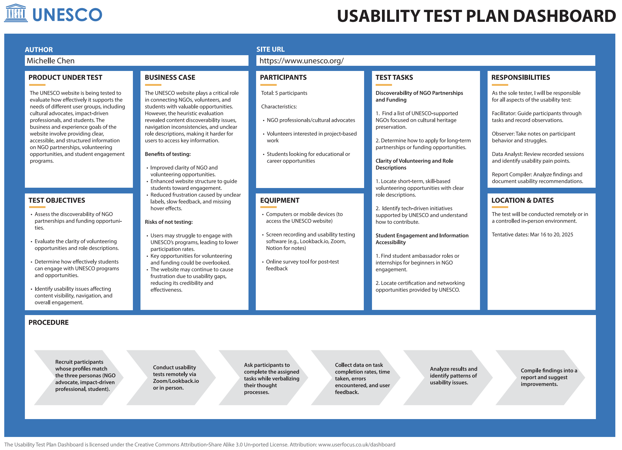
Usability Test Plan Dashboard with script and observation framework
Test plan dashboard and observation sheet.

Phase 02 · Survey

User Experience Research

Motivated users, limited time: navigation was the main blocker.

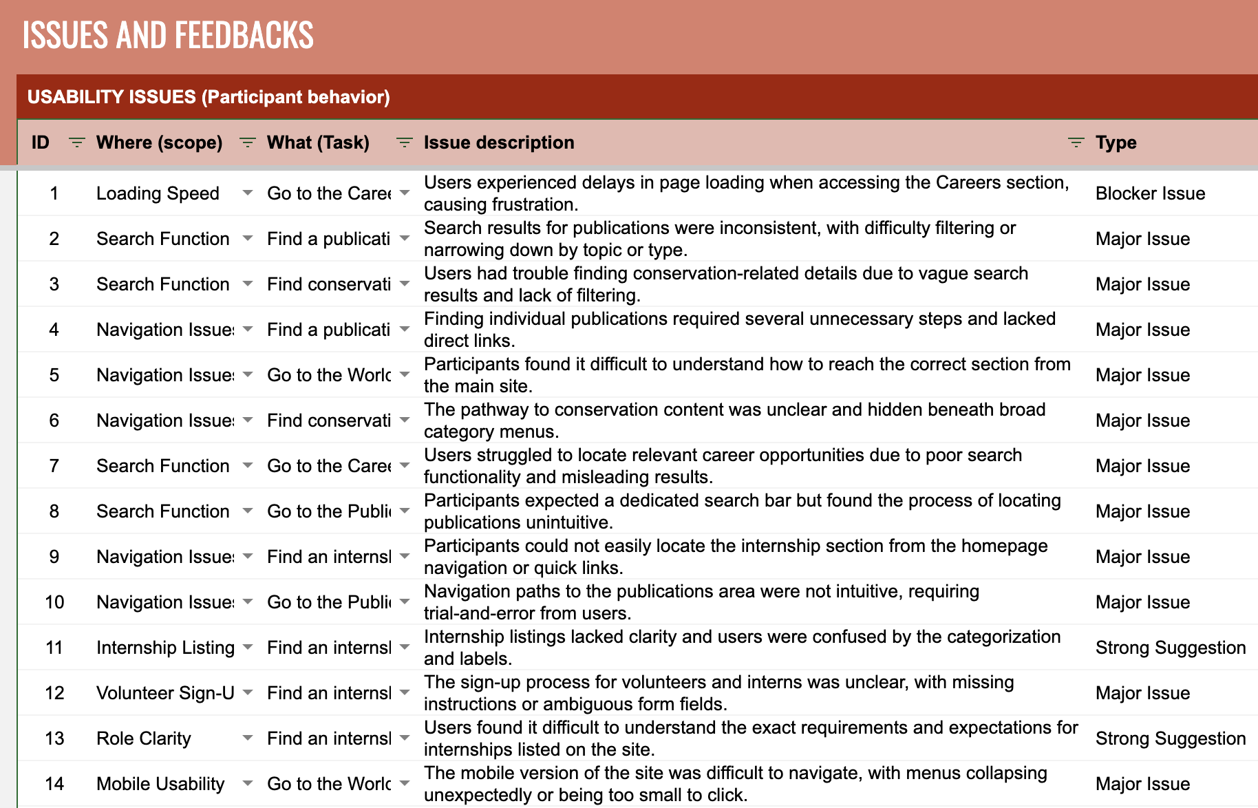
Ten respondents in a UX survey cited confusing navigation and unclear ways to get involved more than lack of interest, and they still wanted career growth and impact.

Findings drove shorter paths to opportunities and clearer engagement entry points.

UNESCO user research issues and feedback documentation
Issues and feedback captured during research: informing navigation and content priorities.

Phase 03 · Personas

Design Targets

Student, advocate, innovator: three design targets.

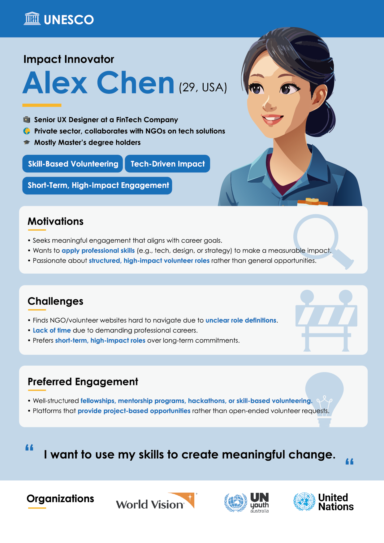
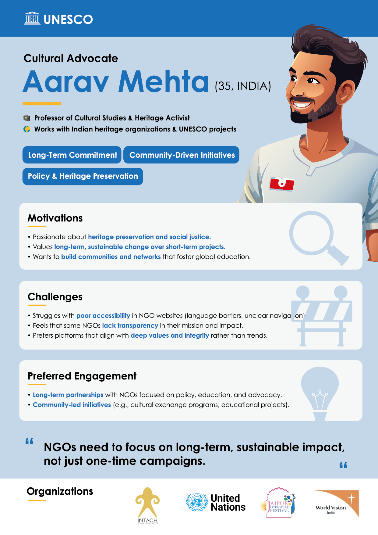
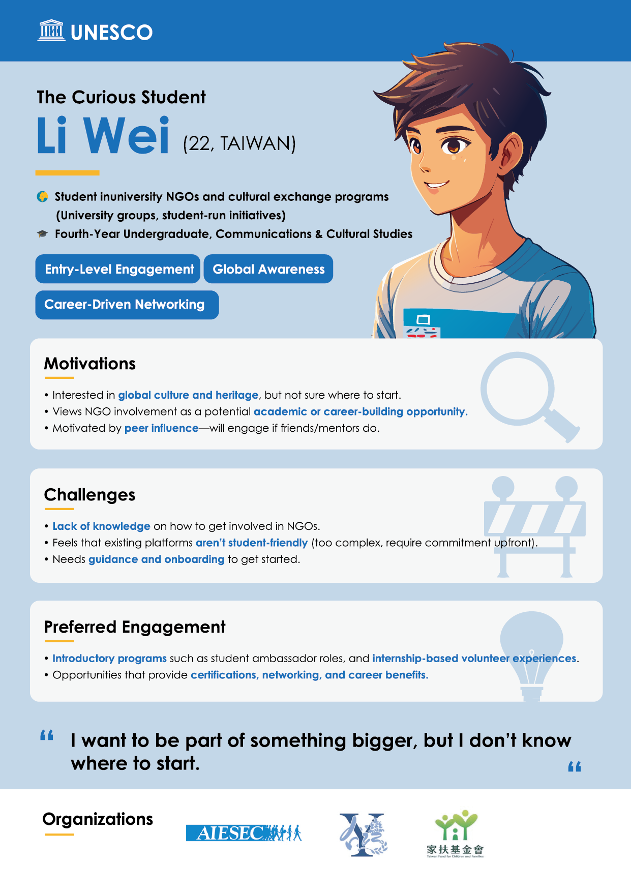
Li Wei (22) needs onboarding; Aarav Mehta (35) wants transparent long-term impact; Alex Chen (29) needs flexible, skill-based short-term roles.

Persona: The Curious Student, Li Wei, 22
Persona: The Cultural Advocate, Aarav Mehta, 35
Persona: The Impact Innovator, Alex Chen, 29

Phase 04 · Audit

Career Portal Blockers

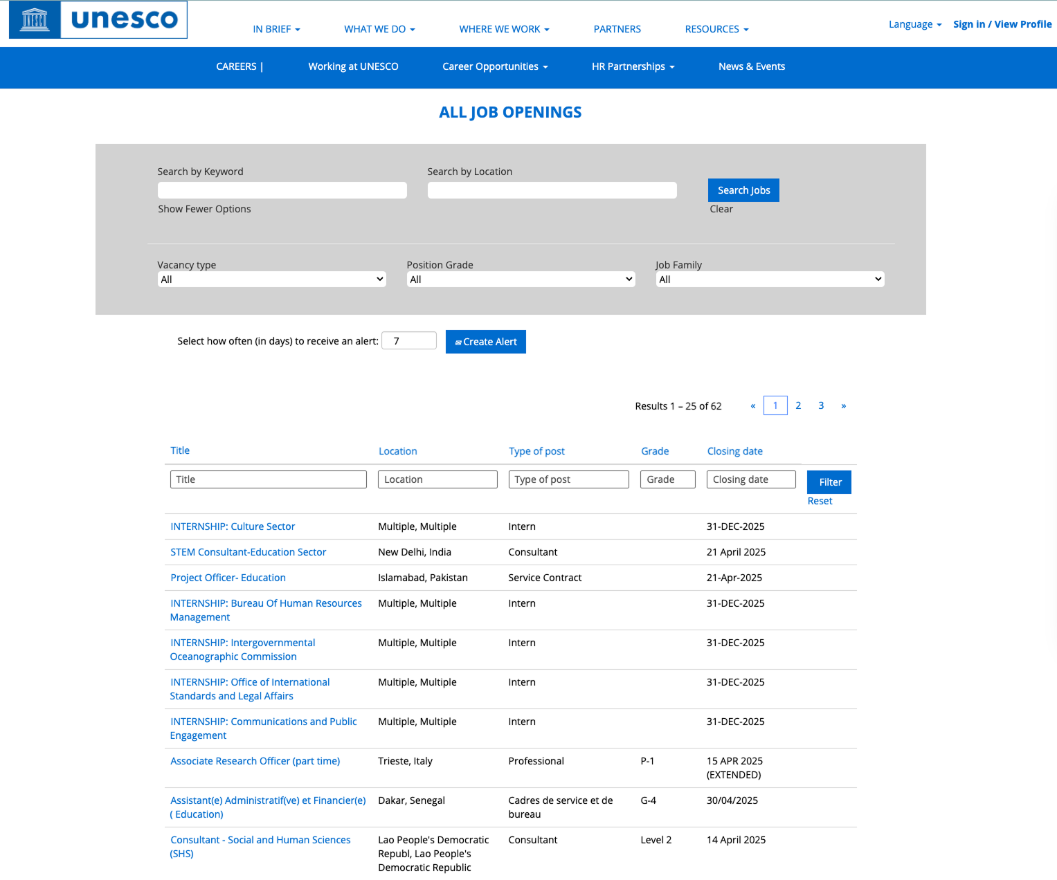
Career search buried off-site: filters that don't match the job list.

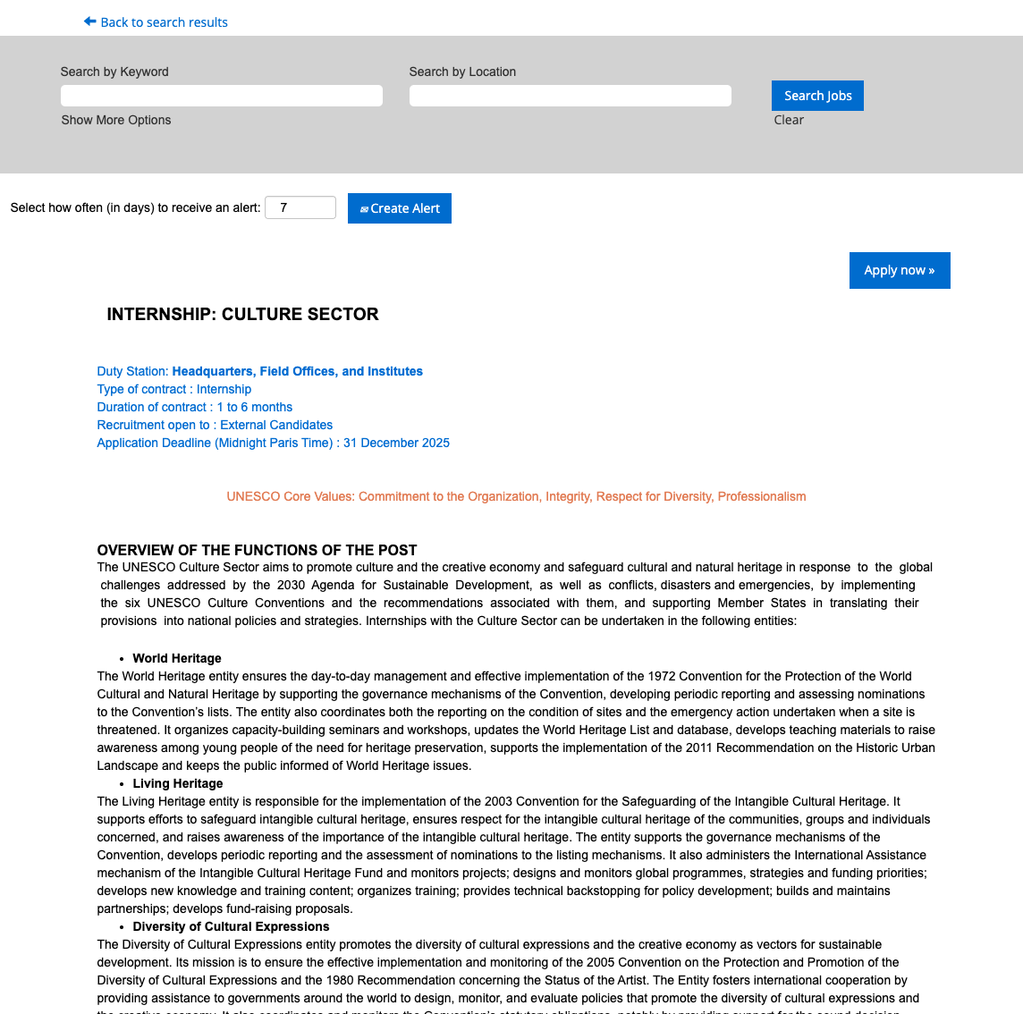
A Career Portal audit found search off the main site, filters that didn't match listings, and dense copy that slowed scanning.

Original UNESCO website interface showing buried navigation and dense text layout
Original site: career search buried off the main experience.
Original UNESCO career job board with overlapping filters and text-heavy listings
Job board: filters that didn't match listings.

Phase 05 · Testing

Iteration

Loading indicators and hover cues reduced hesitation in tested flows.

By testing these user flows, I identified exactly where users hesitated. I iterated on visual feedback, adding loading indicators to reduce perceived wait times and refining hover cues that were missing in the original experience.

Phase 06 · Ideation

Information Architecture

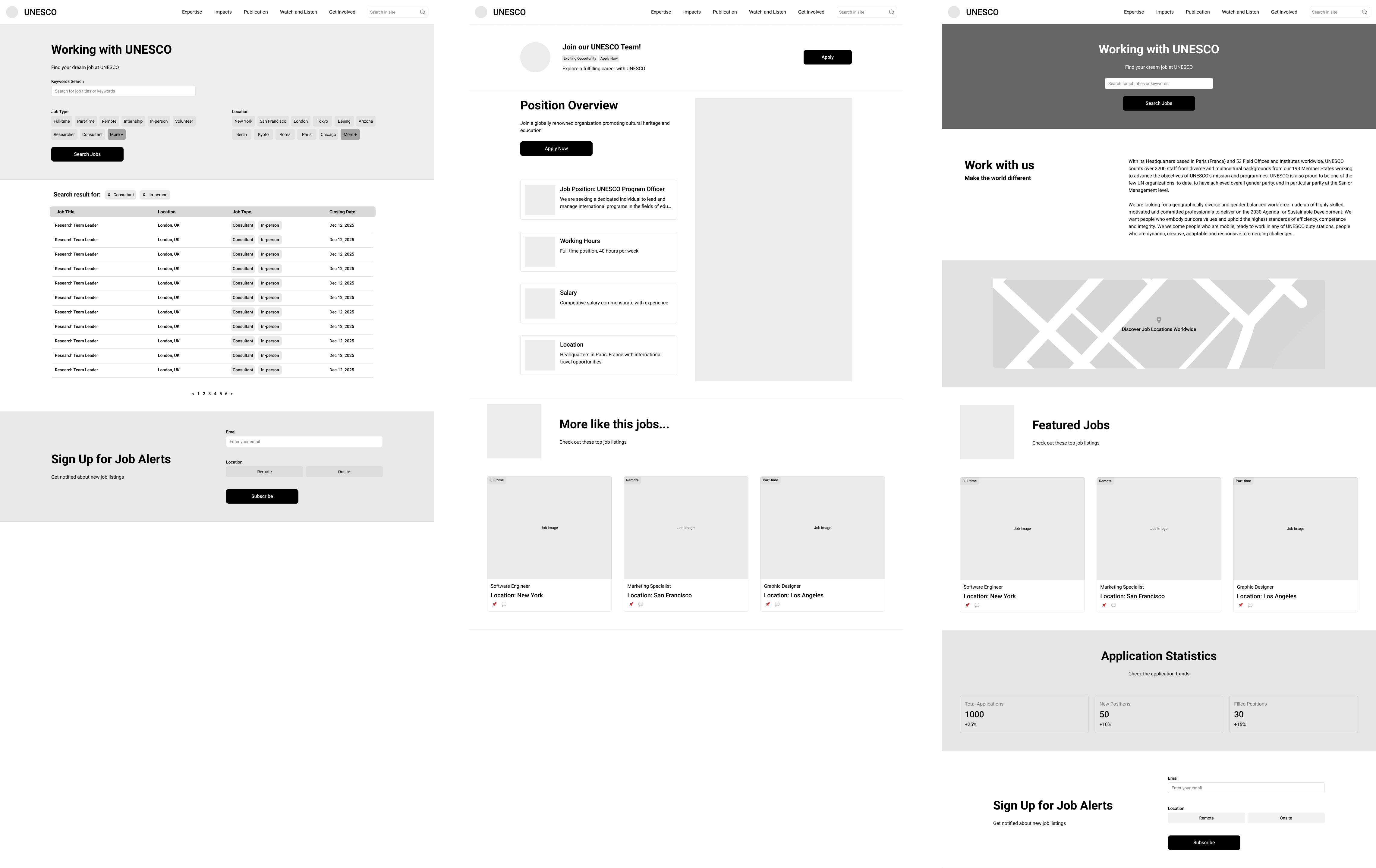
Career search on the home page: filters rebuilt to match the job list.

Career search moved to the homepage; filters now match the job list, with stats, featured jobs, and alerts to cut extra navigation.

UNESCO redesign wireframes showing homepage search and career filtering structure
Wireframes: homepage search surfaced at the top and a reorganized career filtering system.
05 · Reflection & Impact

Clearer paths to participate

UNESCO's scale demands focus: persona-led IA and aligned filters turned a dense job board into paths that match how much time each user can give.

Vision

Volunteering and engagement feel accessible, clear, and worth exploring.

Problems solved

Fewer dead-ends, scannable listings, and filters that match the job board.

Goals achieved

Tested flows for students, skill-based roles, and long-term advocates.

Let's build something
that ships.