Introduction

Overview

Welcome to the case study for the ASU Program on International Lawfare and Security website. As the designer for this project, my objective was to create an authoritative, academic, and highly structured digital platform.

The site needed to communicate complex legal and security concepts while serving as a centralized hub for the program's research, news, and events. This portfolio piece outlines the design decisions that transformed dense academic material into an intuitive, accessible web experience.

01 — Problem Statement

Specialized content, scalable architecture

The concept of “International Lawfare” is highly specialized—merging law, global security, and military strategy. The primary challenge was twofold:

Define Without Overwhelming

The program needed a way to clearly define and educate visitors on what “Lawfare” is without overwhelming them with walls of text.

Organize Growing Content

The site needed a scalable architecture to house growing repositories of academic research, timely news articles, and upcoming events in a way that is easy for scholars, policymakers, and students to navigate.

02 — Project Goals

Authority, readability, and responsive scalability

Establish Brand Authority

Create a visual identity that aligns with Arizona State University's (ASU) primary branding while establishing a distinct, serious, and legal tone appropriate for national security topics.

Enhance Readability

Break down complex, historical definitions of lawfare into scannable, engaging educational sections.

Organize Dynamic Content

Design scalable, user-friendly layouts for diverse content types, including research publications, news op-eds, and event schedules.

Ensure Responsive Scalability

Build a modular design system using consistent UI patterns (cards, grids, timelines) that work seamlessly across desktop and mobile devices.

03 — Design Process

From architecture to component iteration

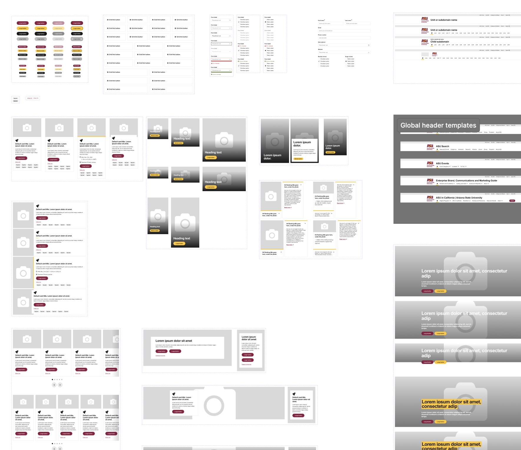
Phase 01 — Information Architecture

Navigation & Categorization

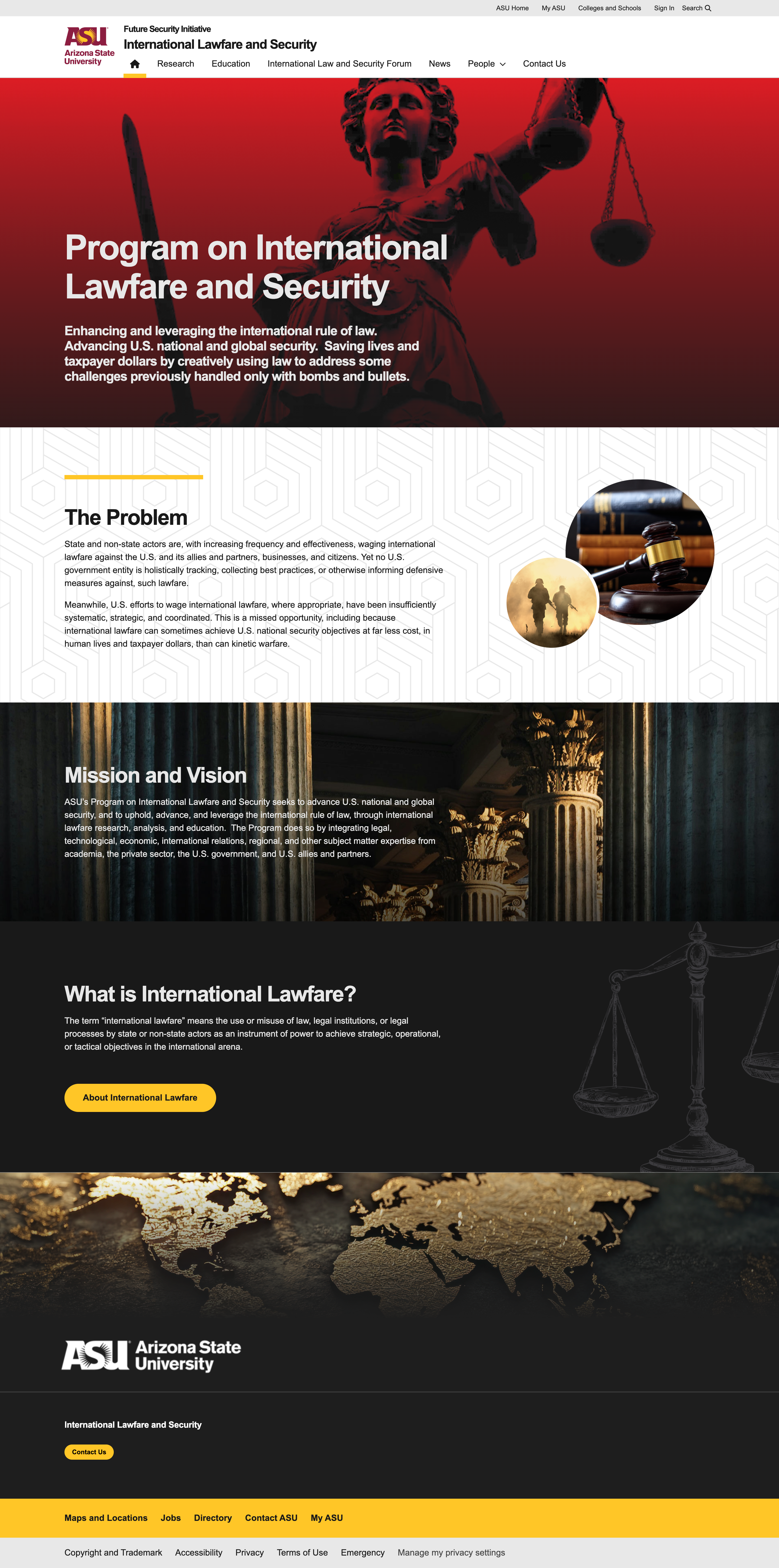
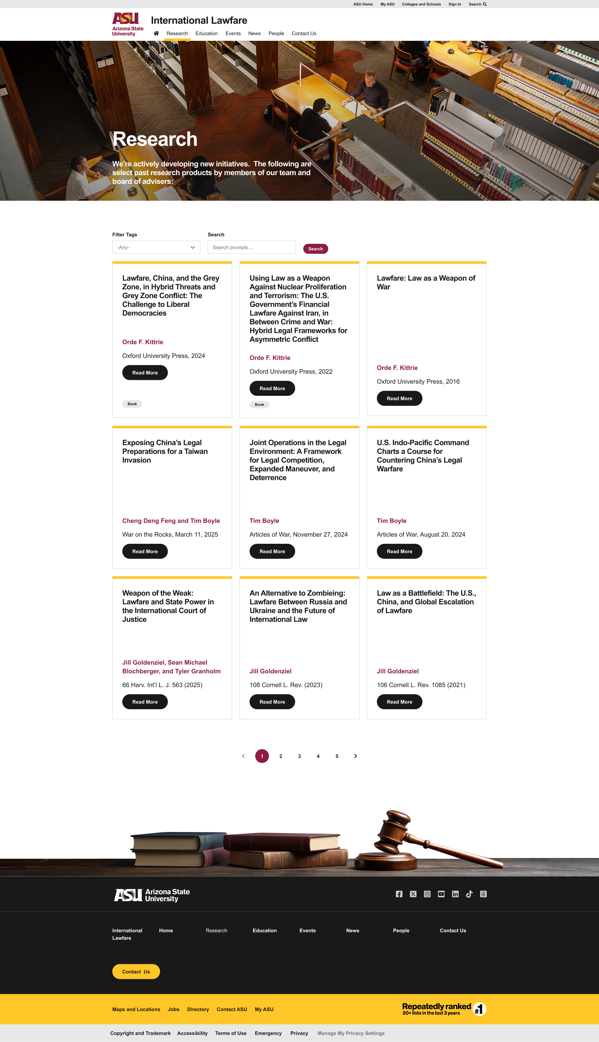
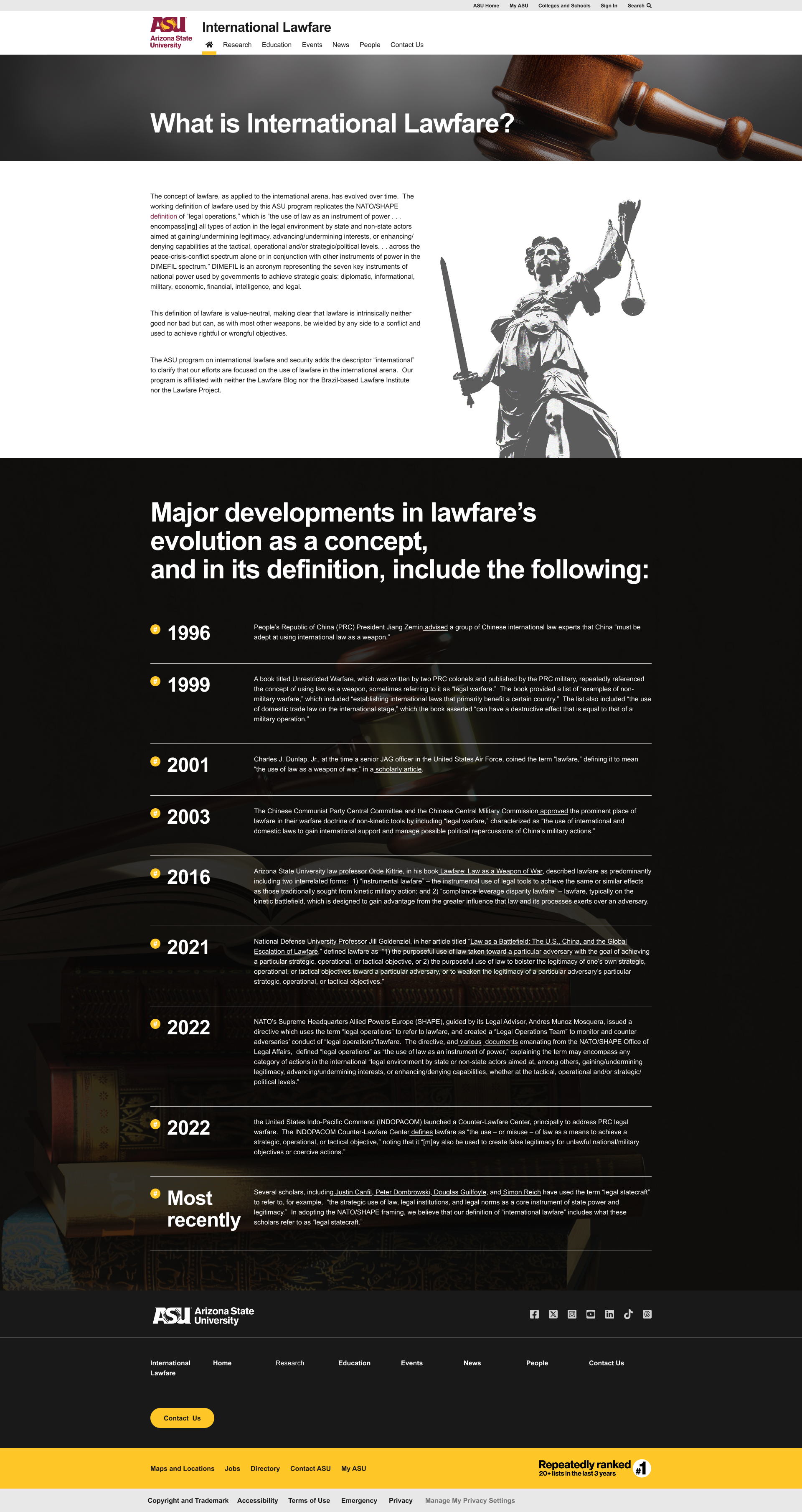
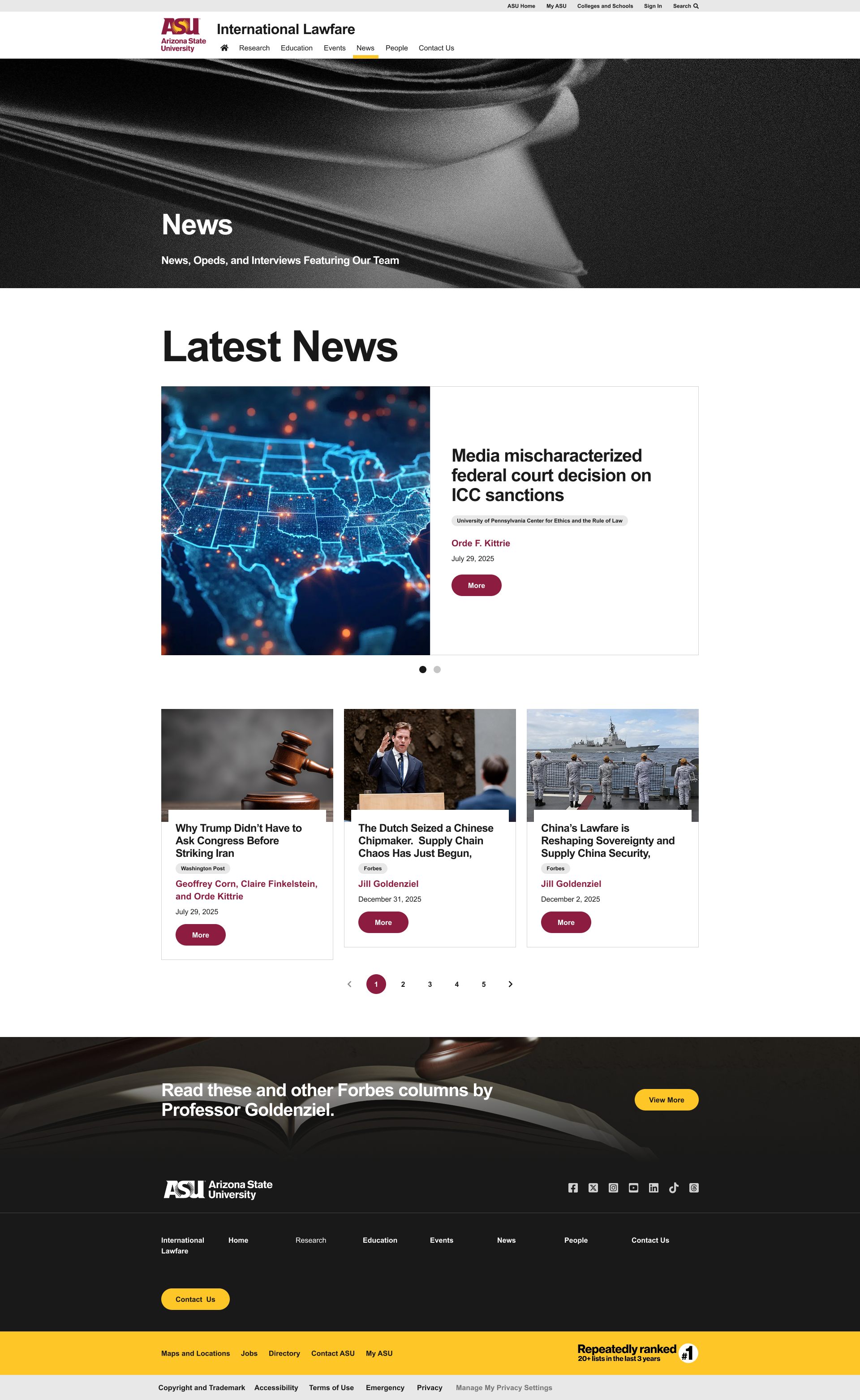
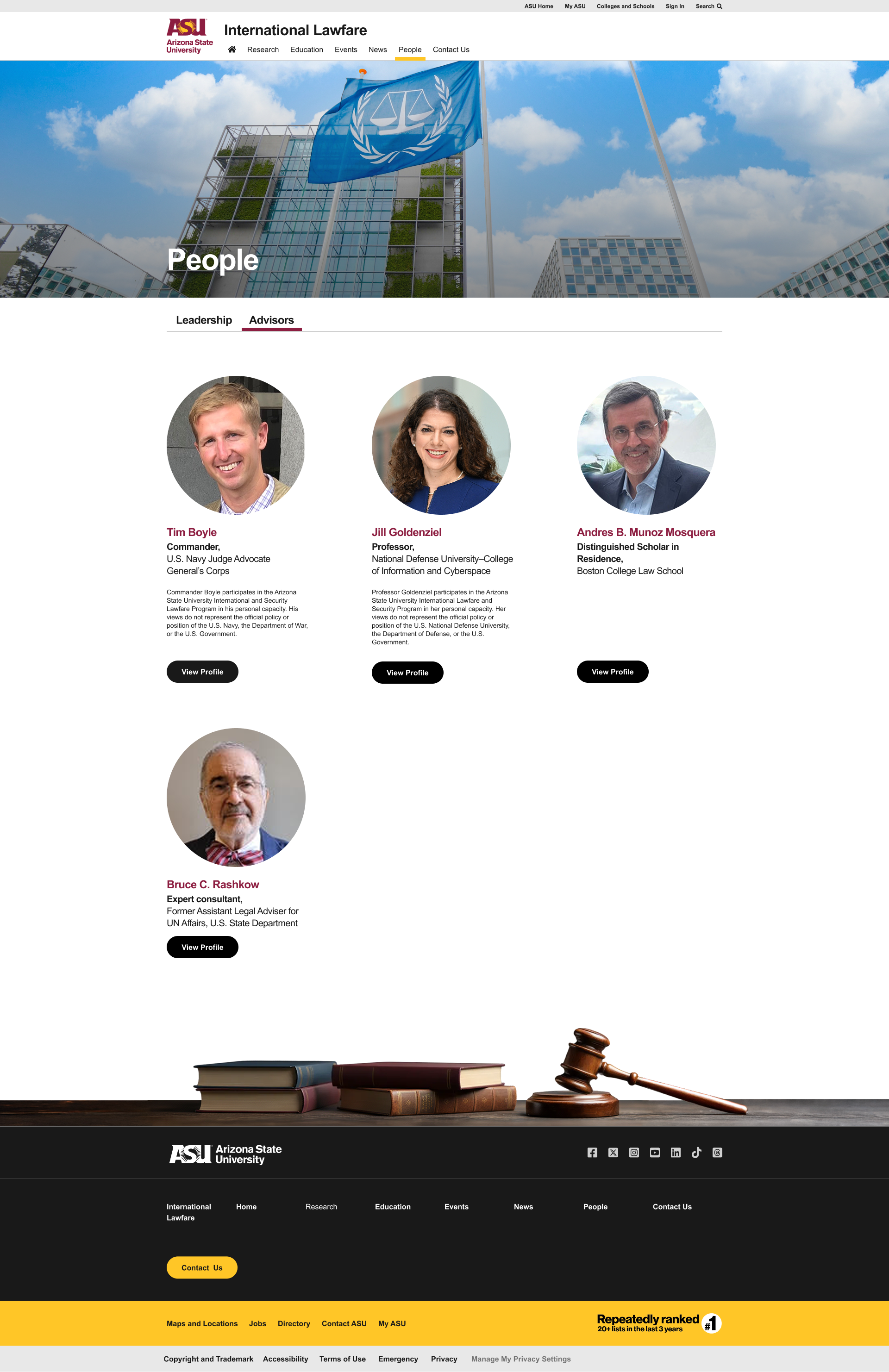
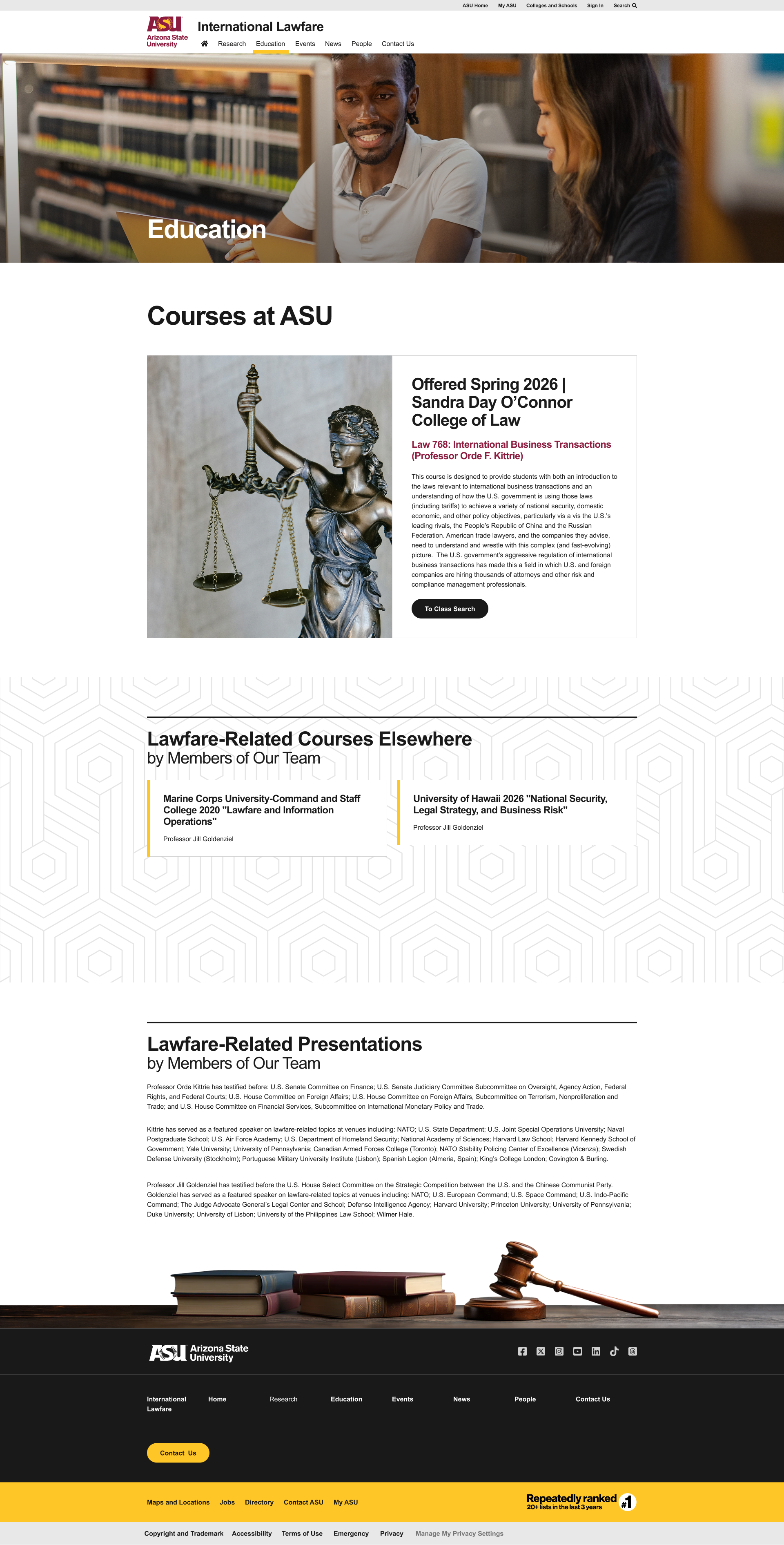
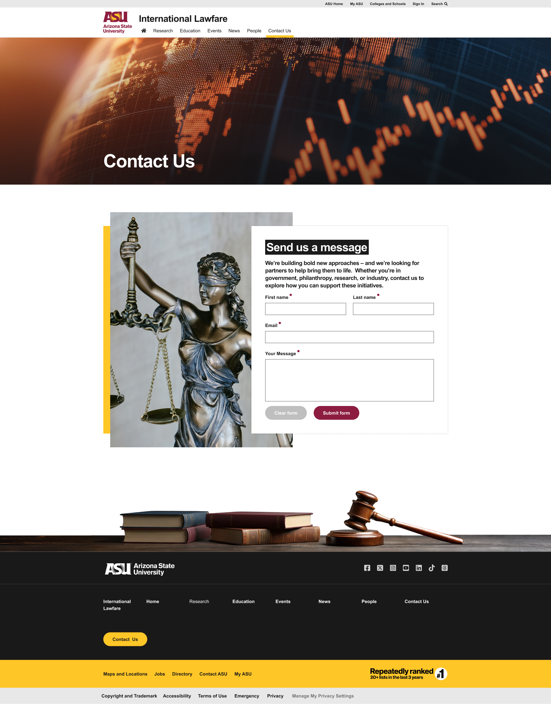
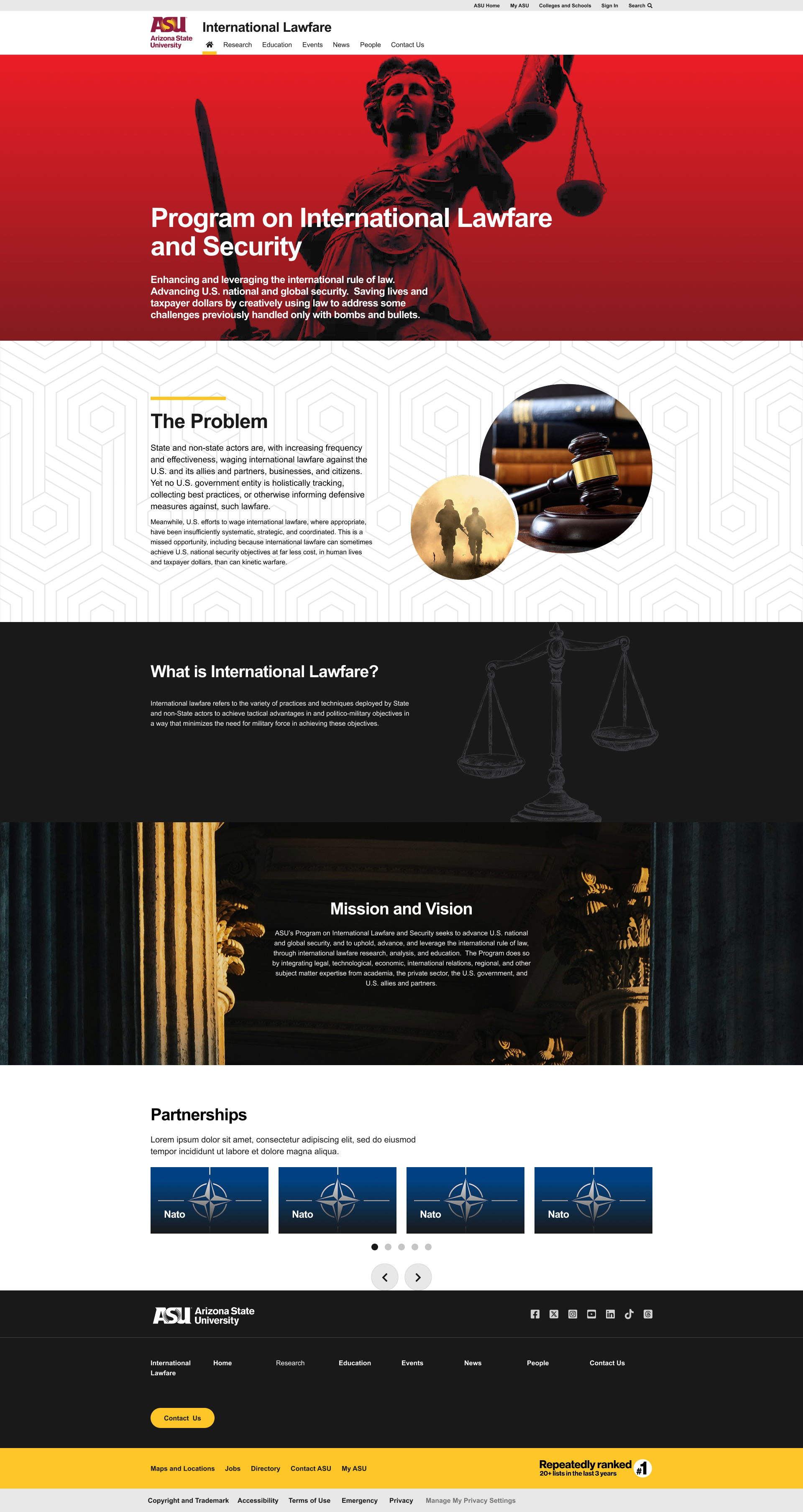
Clear tab navigation — users reach Research, Education, Events, and News in one click.

Before designing screens, I established a clear navigation structure to categorize the program's offerings. The global navigation was broken down into straightforward tabs:

Research Education Events News People Contact Us

This allowed users to jump directly to their area of interest, whether they were looking for a specific research paper or wanting to understand the program's core mission.

Lawfare program homepage showing global navigation and hero structure
Homepage — tab navigation surfaces Research, Education, Events, and News in one click.

Navigation depth — reach key program content

Before IA
5 clicks
Peer average
4 clicks
Redesign target
2 clicks
6 Global nav tabs
4 Content pillars
3 Layout templates
Phase 02 — Layout Strategy

Modular Wireframing

Modular sections keep pages tidy as research and events scale over time.

I opted for a modular, section-based layout for the pages to allow for clear visual breaks in the content.

Homepage flow

Structured to tell a story—starting with an impactful hero image, leading into “The Problem,” explaining “What is International Lawfare?,” and concluding with the “Mission and Vision” and “Partnerships.”

Resource pages

Grid layouts ensure that no matter how many events or research papers were added over time, the pages would remain tidy and structured.

Lawfare homepage wireframe showing modular section-based layout
Modular homepage — section-based storytelling from hero through mission and partnerships.
Phase 03 — Visual Design

Thematic Elements

ASU maroon and gold plus legal imagery build institutional trust.

I leveraged ASU's iconic maroon and gold color palette to maintain institutional trust, building on the ASU Design System for typography, color tokens, and component patterns.

To convey the specific subject matter (law and security), I incorporated striking, high-contrast imagery—such as the scales of justice, gavels, and legal libraries—paired with clean, geometric background patterns to add depth without causing distraction.

ASU Design System showing maroon and gold palette, typography, and UI components
ASU Design System — institutional color, type, and component foundations applied across the site.
Phase 04 — Component Design

Iteration

Cards, timeline, and filters make a large research database scannable.

Card UI System

Uniform cards for Research, Events, and News pages with a strict visual hierarchy.

Interactive Timeline

Vertical timeline on the “What is International Lawfare?” page separates major developments by year.

Filtering Tools

Filter Tags dropdown and Search bar on the Research page to sift through the academic database.

Lawfare Research page showing card UI, filters, and search
Research repository — cards, filters, and search built for a growing academic database.
04 — Key Solutions / Final Design

Educational storytelling and scalable repositories

Four core patterns work together to make dense academic content scannable, navigable, and actionable across the site.

Solution 01

Educational Storytelling (The Timeline)

The historical evolution of lawfare was transformed from an academic essay into a step-by-step visual timeline, clearly marking milestones with gold indicators and concise summaries.

What is International Lawfare page with legal graphic and vertical timeline of major developments
Solution 02

Scalable Content Repositories

The Research page features an intuitive filtering system above a 3-column grid (on desktop) of publication cards. Distinct tags (like “Book”) help users immediately identify the resource type.

Solution 03

Engaging Media Grids

The News page utilizes a featured article layout at the top, followed by a neat grid of secondary articles, ensuring that the latest and most important updates capture the user's attention first.

Research page with filter tags, search bar, and publication card grid
News page with featured article and secondary article grid
Solution 04

Consistent CTAs

Throughout the site, clear, pill-shaped buttons (in ASU Gold or dark gray) guide user actions smoothly—from homepage hero sections through resource cards and pagination.

Homepage with bold hero, alternating content bands, and pill-shaped call-to-action buttons

Additional resource and directory pages extend the same card, grid, and pagination patterns:

People directory page
People — faculty and staff directory layout.
Education page with structured academic content
Education — structured academic content section.
Contact Us page
Contact Us — clear form layout and institutional footer.
05 — Reflection

Professional without feeling outdated

Designing for an academic and policy-focused audience requires a careful balance. The design must be professional and serious without feeling outdated or dry.

By utilizing modern web patterns—like card-based grids, vertical timelines, and high-contrast typography—I was able to inject modern usability into a traditional academic repository. The strict adherence to the university's color palette helped ground the project, while the custom iconography and layout choices gave the International Lawfare program its own unique digital footprint.

06 — Summary / Impact

Problems solved and project vision achieved

Problems Solved

  • Transformed complex, multi-layered academic definitions into accessible, scannable web content.
  • Organized diverse types of media (books, articles, events, news) into unified, easily navigable layouts.

Project Vision Achieved

Delivered a cohesive, responsive web platform that serves both as an educational tool for the public and a practical repository for security scholars. The final product successfully balances institutional branding with a modern, user-friendly interface designed for longevity and content growth.